This tutorial goes through the steps of making a left-oriented website.
Choosing a background for your website -
White website background
(reputable, mainstream) A white website background should almost always be used on a company website, or a site that is trying to sell something. The "white" theme can also be done with a navy blue background, and white text.
Black website background
(cool, different) A black website background should be used if you're making a website that's even slightly non-corporate - games websites, adult websites, personal websites. If your website is a bit different, use black.
Graphical website background
(natural, real) Making your website background graphical (e.g. by tiling), is dangerous, and rarely looks good. A very faint photo or a well-done watermark is okay. I had to tone down the background on my old website several times to get it right.

1 – Setting up the menu area
Your website should always start in Photoshop, not your web page editor.Make a new 500x400 pixel image.
 Zoom out and use the Freeform Pen tool to make an appropriate shape for a website menu. Remember to hold Ctrl whenever you want to move your points around, or drag their "arms". Make sure you have the "Paths" option at the top left of the screen selected. (You must zoom out or maximise the little window you're working in, otherwise you won't be able to drag your points into the grey area.)
Turn it into a selection. (Right click on it and choose "Make Selection".)
Make sure that your points make almost a complete circuit, as the first and last points will connect up when you turn the path into a selection.
2 – Making a website menu with a watermark
 Create a new layer.
 Fill the selected area with a left-right gradient of a colour and a darker shade of that colour. (I used red and dark red.)
Right-click the layer in the layers list, and choose "Blending Options" (Adobe Photoshop 6.0 & 7.0) or "Effects" (Adobe Photoshop 5). Give the area a shadow, bevelling, contour, and a texture (I used Carpet here).
 To create a watermark (lightened area), use the Wingdings font, and type in "jk". It should come out as two swirly symbols.
Press Ctrl+T to rotate them, then make them into a watermark by changing them to an Overlay layer.
If your watermark extends over the edge of your menu area, just right-click it in the Layers list, and Rasterize or Render it, to make it editable. Then Ctrl+Click on your red menu layer, click Select > Inverse, and press Delete, to delete the unwanted part.

3 – Making a logo
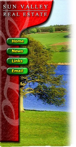
The bulbous area at the tip is where the website's logo goes.Use Times New Roman font here, and put some appropriate text in.The easiest way to put the horizontal line in is by just typing underscores. ( __ )
Right-click each of these layers, and choose Blending Options (Photoshop 6.0 and 7.0) or Effects (Photoshop 5.)
Give each of these layers a 0.5 pixel black Stroke (outline), a Drop Shadow, and a Bevel.
If a black outline of one pixel is still too much, just make the outline 50% opacity, and it will look like it's half as thick.

4 – Making some buttons
Create a new layer. Use the Shape Tool to put in a rounded rectangle. (Select the little square button at the top left that says "create new work path"). Create the shape, and then right-click it and convert it to a selection. (This step is Adobe Photoshop 6.0 and 7.0 only - just use a rectangle in Adobe Photoshop 5.0)Put another light-to-dark gradient across the shape (I've used green), and then give them the usual bevel/contour, texture, stroke, and shadow.
Give the button some text (I've used bold Tahoma), of a new colour (I've used yellow), and give it the usual effects, but without the texture.
5 – Adding a picture
The final touch, which adds a nice effect, is to put a picture of something relevant in behind the menu. You can find stock photography easily on the web. Use the Clone stamp tool to extend the top and bottom of the photo if it's not big enough.
 While holding shift, run a white airbrush along the right side of the image.
Don't worry about the bottom of the image for now.
When you've finished making a website design, always select any non-picture elements (e.g. the menu bar, header text, buttons, and button text) and press Ctrl+U to colour-shift them. Play around with the sliders until you like the colours. (I haven't done this here, because I already knew which colours would look best. :)

6 – Making a "sliver" for your website
A sliver is what I call a thin slice of an image that can be repeated indefinitely on your website, to fill up an area of any size.Save your work here, and do not save it again from this point, as the image will be flattened, and you want to keep your layers for future work.
This step can also be done easily with the Slice Tool, but for simplicity, it has been omitted here.
 Select an area towards the bottom of the image, about a centimetre tall, and as wide as your image.
This area should not have any watermark on it, or any outstanding features in the photo.
Click Layer > Flatten Image, then Image > Crop, to remove everything but the selection. (If you don't flatten the image, it will apply the bevel to the top and bottom edges of your sliver, which is not what you want.)
Click File > Save for Web, and choose Jpeg, Quality 60.
On the History Palette, undo the Crop, but not the flattening.
Select the area of your menu, and click Image > Crop. This selection should be exactly the same width as your sliver.Click File > Save for Web, and choose Jpeg, Quality 60 again.
7 – Making a website layout, using tables
In your web page editor, make a table with two columns.Set the width of the left column width to be equal to the width of your menu image, and set the right column to be around 500 pixels wide. Make the width of the whole table equal to the sum of these two numbers.
Set the background of your left cell to be the sliver image. Then insert the menu image into that cell. Depending on your web page editor, use Hotspots or an Image Map to turn the buttons into links.
To finish up, some words about text...
Obviously, the body text of the page should be black, but what about the headings?
Scroll up and look at the image. The aim is to balance the primary colours - red, blue and green. Which colour is there the least of?
The red menu bar, and the green buttons and grass are each more prevalent than the blue water, so the best colour for the text headers on the page is blue. (Always use a dark shade of that colour when on a white background.)


 Play this Video

